Even the most acclaimed, seasoned photographer doesn’t necessarily know how to shoot for web. The best stock photos on the web are often unsuitable for most website designs, leaving web designers settling for second-rate designs just to get the photos to fit.
Most web designers suffer in silence, sighing and eventually resigning themselves to substandard aesthetics. Instead, this band of web designers would like to write an open letter to photographers everywhere. We have just a few simple needs—if you can provide photos like this, we’d be so happy.
Ultimately, our biggest pet peeve is background photography. So, please read that article. But, for those photographers who would like an overview of how images are actually used on the web, this guide will help. Seeing where your photos could end up may help you take better shots.
Let’s take a look at how photography is typically used on the ‘net, and how to get great photos for each type of application. The most important, most desperate plea is all the way at the bottom.
1. Alternating Content Sections

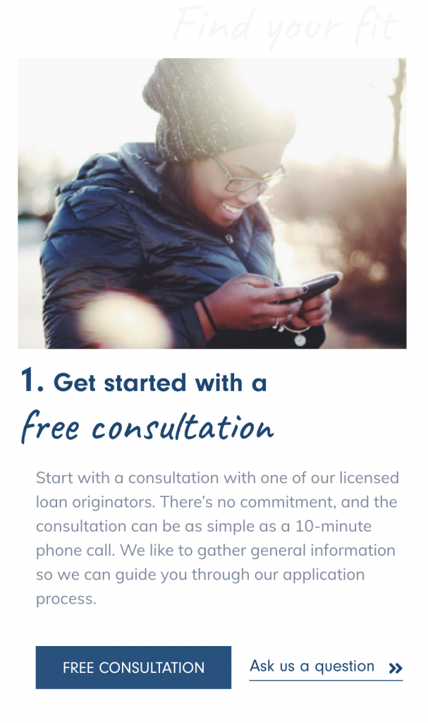
In this example, content alternates with the photo. This is hands-down the easiest way to use a photo on a website. Often, sections are alternated with content left, photo right, then photo left, content right. This method, while simple, can still be classy. In this example, we’ve added two types of buttons, different fonts, watermarked fonts, stars in the brand’s accent color, and negative space to create a nice aesthetic.
On mobile, you can just do something like this, stacking the photo on top of the text and removing unnecessary elements.
Tips: Alternating content photos are by far the easiest to take. Most standard advice on how to take a good photo applies here, so there is a lot to worry about, but none of it is unusual. These photos look chaotic when there is too much subject matter, since they are already being placed next to a block of text.
This is a great way to show photos, however, after a while the user starts to get the picture. Left, right. Right, left. Left, right. There’s only so much of this we can take before we want something different.
2. Filtered Background Sections
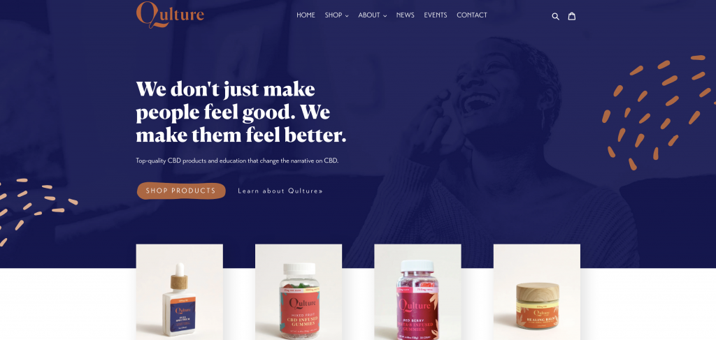
This example is pretty simple because the photo doesn’t have to be very specific. You can pretty much wash a large photo with a filter and it will look elegant. The user subconsciously picks up on the spirit of the photograph, even if they don’t consciously register it. On mobile, it can be a bit tricky:

As you can see, it still looks good on mobile because the filter means the photo doesn’t have to be anywhere specific. This is inherently one of the problems with responsive web design. It has to work for all screen sizes. Gone are the days where you could shoot a “resolution” over to a designer and have them crop a photo perfectly. The photo could be 4000 pixels wide on a 4K TV, 1024 pixels wide on a tablet, or 400 pixels wide on a phone. And the photo has to work for every one of those situations.
Tips: Try to take photos with the subject matter on the left or right. The “rule of thirds” applies here. The more uniform the background can be, the better. Photos “filter” best when the content of the photo is fairly similar across the canvas. Don’t take photos with a lot of detail, and depth of field and light scatters are great. Keep in mind, you should leave lots of space on the top and bottom of the photo. More on this later.
3. Cutout Images
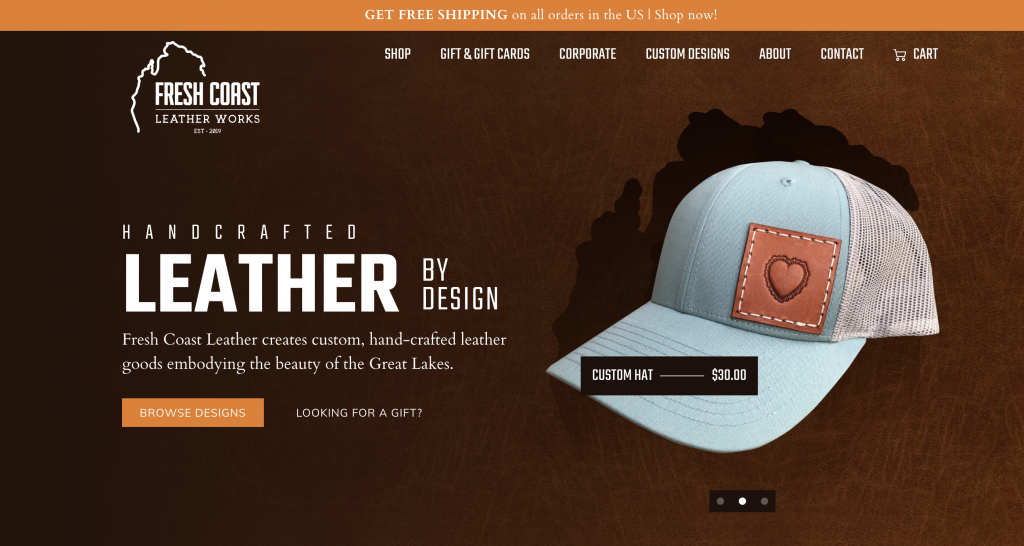
In this case, the image is cut out and overlaid on a different background entirely, so it works. This is primarily used for products, but it could also be used for people:

Tips: An extremely clear photo is best, so set your camera to the highest resolution possible and work hard to focus on the object. Make sure that nothing else is obscuring the subject, and that we can see the entire subject. A lot of depth of field is not ideal with this kind of shot, so an F-Stop as high as 7.0 can be useful. Even lighting across the subject is best—this isn’t necessarily the time for moody light, unless you have a specific vision you’re going for with the web designer.
4. Filtered Boxes

Images may also end up filtered and placed in boxes, as follows. In this case, the images get darker as we move towards the bottom left, overlaid with a black filter. This is an aesthetically pleasing way to combine text and image that is easy for users to follow.
Tip: Using focal blur with these photos and keeping the details in the photos minimal is great. These photos will compete with the text if there is too much detail. Also, make sure to keep the corners relatively unobscured so that they can be filtered and text added. If you want to add a focal point, make sure it is up in the top, towards the center.
5. Background Images
Background images are the most notoriously tricky of all the web placements. They look amazing, because they make the text feel “one” with the page. However, they can look the most elegant.

We’ve created another article entirely to talk about handling these, so make sure to check out our article on background images for web.
Hopefully, understanding the different ways your photographs could be used online will give you a good idea of how to take them. Overall, we web designers are just thankful you photographers are out there to capture the moments and products we’re here to feature. Thank you for all you do!