Background images are crucial to creating the very best web designs. Background images are the most stunning-looking type of photography on the web, but are, unfortunately, really hard to pull off. Traditional photography techniques don’t usually result in usable background images. Even the most acclaimed, skilled photographers don’t usually take great background shots.
Why not? Well, it’s partly because they don’t plan for how copy space (the space that the text will take up) will be used in a photo. But, even if they do, they may still miss something.
In the “old days” of web development, an image showed up at a certain resolution, and that was that. Now, if a designer says, “what resolution should it be?” we cringe a bit. It’s not so simple any, and that’s because of responsive web design.
Let’s take a look at an example of a great background photo.

This is one of our favorite website headers, mostly because it is so striking. The subtle greens and blues provide gentle pops of color that fit with the clean white, and the text is extremely legible. It feels like it’s “floating” in space and gives a sense of depth to the photo.
Interestingly, we had to edit this photo a lot—digitally extending the background and adding a white filter to the right side. And that’s because most photos aren’t taken with the web in mind.
Let’s look at a second great background photo. This photo is very similar to the one above, but obviously flipped to the other side and dark, not light. Here, there is light text on a dark background rather than dark text on light.

This placement seems simple and obvious, but it’s not.
To illustrate the point, let’s create a sample background image and preview what it would look like on different devices. In this example, we’ve got a fake brand ready to go:
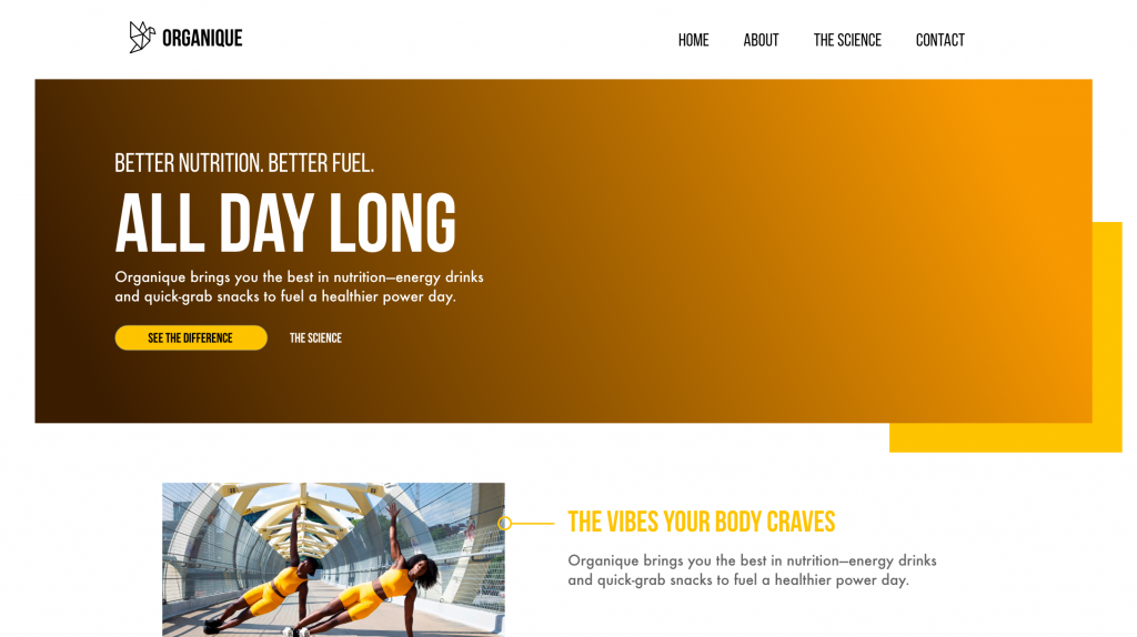
Let’s use our fake brand, “Organique”, as an example. Let’s pretend we’re searching for the perfect stock photo. Here’s a great photo we could use, which is representative of the type of photo we are often sent. This is a great photo, but probably won’t be a very good background photo. Let’s see why.
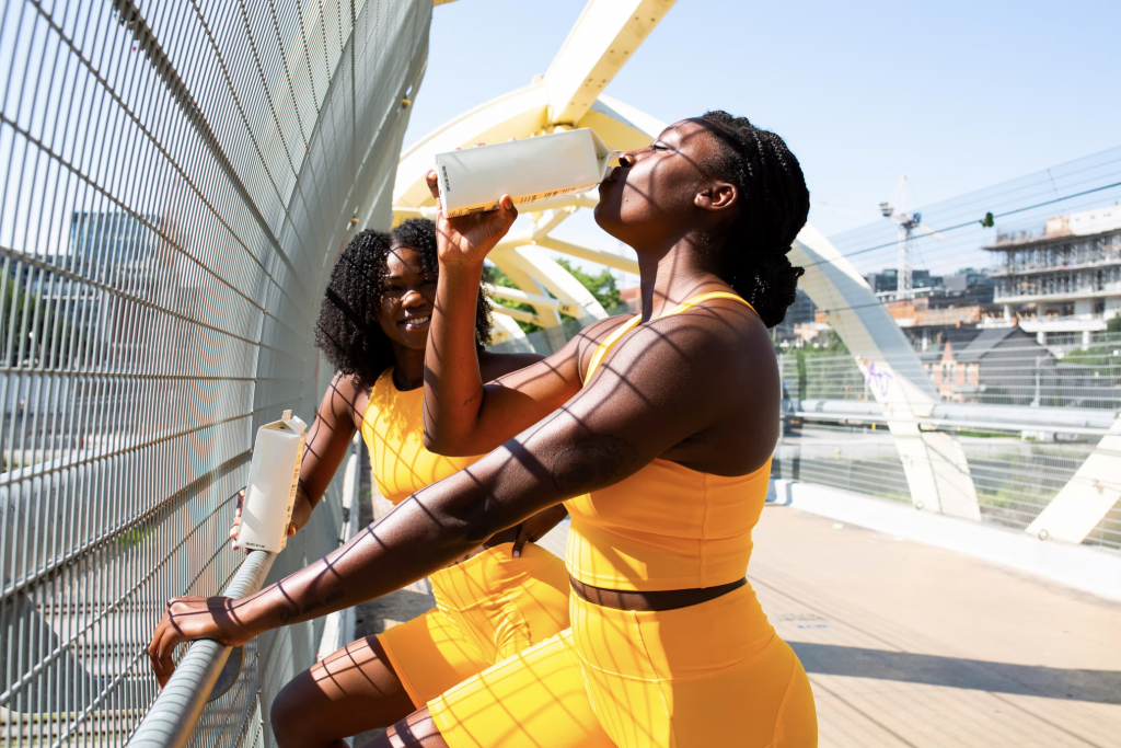
There are a lot of problems here, but we’ll go over a few of them:
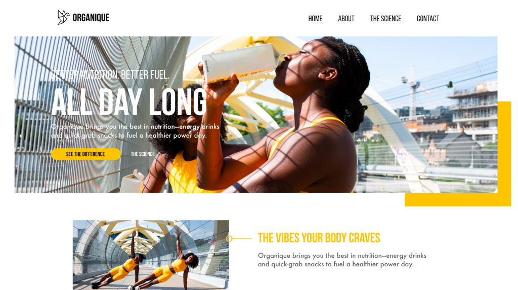
First, the women’s heads are both focal points, and it looks odd to have text going over them. See how one woman’s face is covered up in the image above? Well, we could slide her up. The only problem with this is then the first woman’s head is now completely cut off:
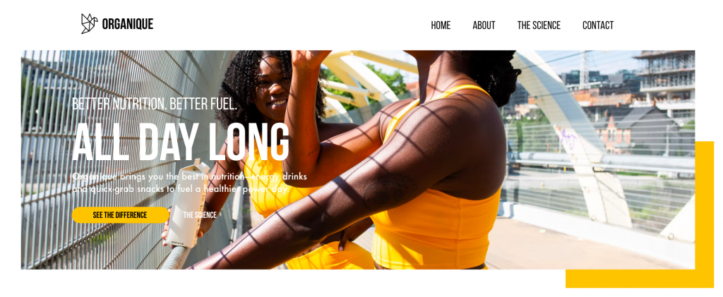
We could slide both women over to the right, but then we run out of image on the left side, because there is not enough copy space. We end up running out of image on the left side.

We can even try digitally extending the background, but that is tricky and ends up looking weird:
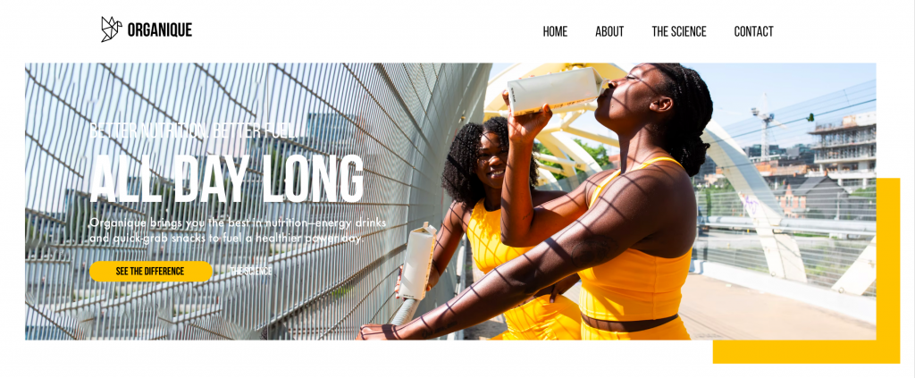
Ultimately, we could make this image work, but it’s certainly not ideal. Let’s look at a photo that is better-optimized for being a background image.
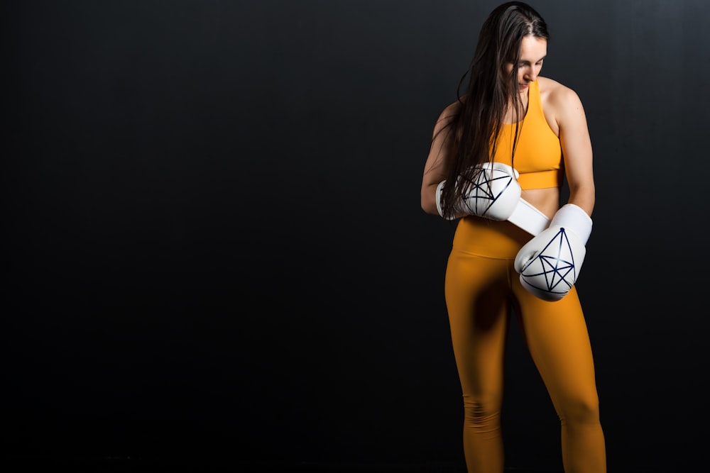
At first glance, this photo seems GREAT! It’s taken with the Rule of Thirds (the subject occupies a third of the frame), it matches our color scheme, and there’s plenty of space for the text. Or so it seems. Let’s look at why it’s actually not quite the best fit.
You can place her in the space, but you can’t really see the gloves anymore. This could be considered okay, but if we really want to see the gloves we want to adjust.

And as you can see, when she’s placed in an ideal position so that you can see the gloves, we run out of space on the left and right side.

So you see—the ideal image needs WAY more copy space than you would think! We created this version where the woman extends to display enough copy space for flexibility. The amount we need is ridiculous. It’s less like the “rule of thirds” and more like the “rule of fifths”. The subject takes up a quarter to a fifth of the space on the screen, and they have lots of extra padding around them on the top, left, and right.

This is not the traditional rule of thumb for photographing a subject, that’s for sure. But, it’s very helpful for web designers. We face the problem of “not enough copy space” every day. As it turns out, you can search Adobe Stock and most other stock websites for “{your search term} copy space”. And these services are getting better at providing web photos that actually work for backgrounds. Take a look at a search for “man copy space” on Adobe Stock.

Notwithstanding the silly shirt that is the first picture, you can see that some photographers are providing enough copy space, and some aren’t. Not every photo needs lots of copy space, but many background images do. We’re glad that the world of photographers is slowly learning about this important skill.
With that being said, let’s look at how to take great background photos.
Quick Tips
Here are a few tips to get you started:
- Pull back. You probably need more background space than you think. Pull back, and make sure there is more empty space to the sides and top of the subject, if not the bottom too. Remember, you’re looking for the subject to fill more like 1/4 to 1/5 of the space. When in doubt, pull back more.
- Shoot for clarity at high resolution. When you pull back, the subject of the photo will get grainier and more blurry. Turn your camera to the highest possible resolution, focus carefully, and press the button slowly as to avoid jiggling the camera. We’re going to focus on the subject of the photo, even if they look teeny-tiny in your lens.
- Add some background blur. Text on top of blurry depth of field looks great. The background doesn’t have to be in focus, in fact, it’s better if it’s not. The more definition you have in the background, the more it may compete with the text.
- Keep the background dark or light. As a significant part of keeping your background consistent, make sure it stays dark or light, so overlaid text will be readable. We can filter the background to make the text readable, but the less we have to, the more natural it looks.
Background Images Shot List
Here’s a quick list of what we’re looking for, and there are some concepts attached. In general, the copy space you think you need as a photographer is way less than you actually need for responsiveness as a web developer. Rule of thumb, triple the copy space you think you need. You can always crop later but it’s pretty hard to digitally extend the background.
- Headshot
- Light background
- Dark background
- Wide Shot (Not quite full body)
- Copy space left, light background
- Copy space right, light background
- Copy space left, dark background
- Copy space right, dark background
- Full Body
- Copy space left, light background
- Copy space right, light background
- Copy space left, dark background
- Copy space right, dark background
Example Spacing
Here are a few examples of good photo spacing. Notice how it’s actually quite a lot!
With these tips, we hope you’re ready to rock your next photography session. We web developers will thank you.
Don’t forget to check out our article on 5 Different Types of Photos Used on the Web (And How to Photograph Them).